Friday, March 25, 2011
Thursday, March 24, 2011
Finished production
Untitled from JamieReeves on Vimeo.
Here is the finished film all edited and completed. We are happy with it even with the problems we faced throughout the production of it.
Thursday, March 17, 2011
Ancilery Products
Magazine Review
The magazine review has now been completed by myself, Jamie reeves and conor murray. Conor completed the layout and some of the information that is in the magazine review and I also contributed to the information in the review about our film. The magazine review is 2 A4 pages which is set in into a double page spread. The review consists of information about the film and some of the techniques that are used in it and also some ratings of the film from other sources and some screen shots of the film.
Below is a link to our magazine review.
Magazine review
Film Poster
The film poster has now been completed by Jamie reeves, Conor murray and myself. Jamie completed the layout of the pictures text and headings that are included on our poster. Conor Murray was the person that provided the photos that are included on our poster. I completed a draft layout of how our poster was going to look who I then gave to jamie to completed our final poster because he is more experienced with using photoshop.
Below is a link to our film poster
Film Poster
Thursday, March 3, 2011
Exhibition.
To find out the best way of exhibiting our film I decided to look at our market research in more detail to see if I could find out the best place for our film to be exhibited. The main types of exhibition are: Television, Cinema release and on the internet.
I decided that our film should not be shown through television. The main problems are that it would be to expensive and it would not be shown to our target market as well because of the variety of age ranges that watch the telly.
A cinema exhibition would also not be appropriate because it would be to expensive for our budget and also our film would not be at a high enough standard for a cinema exhibition.
We have decided to exhibit our film on the internet for a number of reasons. The first one is that there are a majority of sites for us to show our film and also not be charged any money. Another reason is that our target audience is the highest consumer on the internet and more likely to view are film on the internet than older age groups.
Thursday, February 17, 2011
Character models.
Our main production consists of three main characters. They are known as the Significant extra, The protagonist and the main antagonist. We also have to characters that follow the main antagonist. Below is a link to conor's blog for the image and description of each character.
Our script
- 12pt Dark Courier
- Left margin: 1.6in (4.06cm)
- Right margin: 3/4in (1.9cm)
- Dialogue: 2.6in(6.5cm)
- Character Name: 3.9in (10.0cm)
- Parentheticals: 3.3in (8.0cm)
- Character Names: Upper case on first introduction, lower case from then on
- CAPITALISE: Significant props and sound (eg. a KNIFE, a BANG)
- CAPITALISE: Key points of direction (eg. ZOOM, JUMP-CUT)
I am going to rewrite our script using all of the bullet points above, and then I will link it to my blog via this post.
Thursday, February 10, 2011
What our audience would be according to the regulation bodies
After looking at the audience bodies research that I have researched and posted on to my blog I have now applied all of this to the audience that we are hoping to attract the most. Here is a link to the audience research post on my blog. Audience Research
Using the NRS social grade which determines a household into each category by using the occupation of the head of the household to organise them. By looking at each of the grades we are aiming for the C2-D grade. This is because we are aiming at a younger audience and we assume that younger people would be in these categories because young people tend not to have a highly paid profession when they are younger. We have Identified a young audience because they are the biggest film consumers out of all the age groups.
The acorn system categrises all of the united kingdom postcodes into various types based on census data and other information such as lifestyle surveys. By using this data we asume that a younger audience would be classified in moderate means and possibly hard pressed groups. We are aiming at these because we believe that a younger audience would mainly be asociated with these groups.
Thursday, February 3, 2011
Conventions of a short film.
- Short films all generally follow the same style of how they are filmed. I have watched a few short films now and I have noticed that they usually contain no more than three characters with one of them being mainly focused on.
- Also the storyline that they have tend to have a twist in them. This is because they are so short that if they didn't include a twist in them they just simply wouldn't be enticing to an audience. Short films also tend to have a lot of point of view shots. This is because short films are mainly about a characters life and the best way to portray this story is to see it how the character sees it.
- Voice overs are a very popular method of sound in short films, and it is often found in short films that a voice over would be used instead of dialogue, there could be many reasons for this, for one it is cheaper to record a voice over than use a high tech boom, but also if the story is about someone's life, the voice over would normally be that of the central protagonist.
- Another convention that a short film has is that it tends to be between 1-5 minutes long.
First time using photoshop.
To create our magazine review and the poster for our film we decided that we would use photoshop. Photoshop has all of the tools and effects that are needed for us to create a magazine review and film poster at a very high standard. I have never used photoshop before so I decided to have a first time mess around to help me learn and get used to the software. Below is a quick poster that I have created using basic techniques and the basic tools that photoshop has to offer.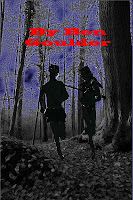

After I had completed my photoshop poster for the first time I decided that the photoshop part of the magazine article and the poster that we were creating was not going to be done by me. The film poster will be created by jamie and I will recreate the poster in a way that I would have done it.
Market Research Review
Here is our market research review that my group members filmed because I was ill on that day.
Review of Market Research from JamieReeves on Vimeo.
Link to Jamie's Blog
Market Research
Here is our market research.
Market Feedback from JamieReeves on Vimeo.
A link to the full post. Jamie reeves
Monday, January 31, 2011
Progress Specification
Here is my progress specification which I have colour coded so it is easy to see what I have done and what needs to be done.
Key
Red-Not started
Yellow- Started but not yet finished
Green-Completed.
Print:
Level 3 36-47 Marks
There is evidence of proficiency in the creative use of many of the following technical skills:
framing a shot, including and excluding elements as appropriate;
using a variety of shot distances as appropriate;
shooting material appropriate to the task set;
selecting mise-en-scène including colour, figure, lighting, objects and setting;
manipulating photographs as appropriate to the context for presentation, including cropping and resizing;
accurately using language and register;
appropriately integrating illustration and text;
showing understanding of conventions of layout and page design;
showing awareness of the need for variety in fonts and text size;
using ICT appropriately for the task set.
Level 4 48–60 marks
There is evidence of excellence in the creative use of most of the following technical skills:
framing a shot, including and excluding elements as appropriate;
using a variety of shot distances as appropriate;
shooting material appropriate to the task set;
selecting mise-en-scène including colour, figure, lighting, objects and setting;
manipulating photographs as appropriate to the context for presentation, including cropping and resizing;
accurately using language and register;
appropriately integrating illustration and text;
showing understanding of conventions of layout and page design;
showing awareness of the need for variety in fonts and text size;
Using ICT appropriately for the task set.
Video:
Level 3 36–47 marks
There is evidence of proficiency in the creative use of many of the following technical skills:
holding a shot steady, where appropriate;
framing a shot, including and excluding elements as appropriate;
using a variety of shot distances as appropriate;
shooting material appropriate to the task set;
selecting mise-en-scène including colour, figure, lighting, objects and setting;
editing so that meaning is apparent to the viewer;
using varied shot transitions and other effects selectively and appropriately for the task set;
using sound with images and editing appropriately for the task set;
using titles appropriately.
Level 4 48–60 marks
There is evidence of excellence in the creative use of most of the following technical skills:
holding a shot steady, where appropriate;
framing a shot, including and excluding elements as appropriate;
using a variety of shot distances as appropriate;
shooting material appropriate to the task set;
selecting mise-en-scène including colour, figure, lighting, objects and setting;
editing so that meaning is apparent to the viewer;
using varied shot transitions and other effects selectively and appropriately for the task set;
using sound with images and editing appropriately for the task set;
using titles appropriately.
Audio
Level 3 36–47 marks
There is evidence of proficiency in the creative use of many of the following technical skills:
recording voice(s) clearly in studio/confined setting;
recording voice(s) clearly in location/outdoor interviews/presentations;
accurately using language and register;
integrating recorded material, as appropriate;
editing and mixing sounds appropriately;
editing to create continuity and meaning;
integrating jingles, music, location sounds and sound effects, where appropriate.
framing a shot, including and excluding elements as appropriate;
using a variety of shot distances as appropriate;
shooting material appropriate to the task set;
selecting mise-en-scène including colour, figure, lighting, objects and setting;
manipulating photographs as appropriate to the context for presentation, including cropping and resizing;
accurately using language and register;
appropriately integrating illustration and text;
showing understanding of conventions of layout and page design;
showing awareness of the need for variety in fonts and text size;
Using ICT appropriately for the task set.
Video:
Level 3 36–47 marks
There is evidence of proficiency in the creative use of many of the following technical skills:
holding a shot steady, where appropriate;
framing a shot, including and excluding elements as appropriate;
using a variety of shot distances as appropriate;
shooting material appropriate to the task set;
selecting mise-en-scène including colour, figure, lighting, objects and setting;
editing so that meaning is apparent to the viewer;
using varied shot transitions and other effects selectively and appropriately for the task set;
using sound with images and editing appropriately for the task set;
using titles appropriately.
Level 4 48–60 marks
There is evidence of excellence in the creative use of most of the following technical skills:
holding a shot steady, where appropriate;
framing a shot, including and excluding elements as appropriate;
using a variety of shot distances as appropriate;
shooting material appropriate to the task set;
selecting mise-en-scène including colour, figure, lighting, objects and setting;
editing so that meaning is apparent to the viewer;
using varied shot transitions and other effects selectively and appropriately for the task set;
using sound with images and editing appropriately for the task set;
using titles appropriately.
Audio
Level 3 36–47 marks
There is evidence of proficiency in the creative use of many of the following technical skills:
recording voice(s) clearly in studio/confined setting;
recording voice(s) clearly in location/outdoor interviews/presentations;
accurately using language and register;
integrating recorded material, as appropriate;
editing and mixing sounds appropriately;
editing to create continuity and meaning;
integrating jingles, music, location sounds and sound effects, where appropriate.
Thursday, January 27, 2011
Poster Analysis
Film posters for all genres all basically use the same layout but change background colours, the main picture and the captions that are used. Film posters can tell alot about a film from just the colours used and the layout of the poster. Below is a list of different films from different genres and how the designs change.
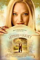 Letters to Juliet uses very calm and neutral colours which tell the reader that the film has a very non complex storyline and it can be easily consumed.
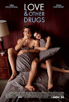 The love & Other Drugs film poster is a little different to the normal conventions of a romance film poster. It uses dark red for a main background instead of a soft colour such as a peach or cream. The poster still shows the reader it is a romantic film but in a different way to other romance films. It does this by having the actors lying on a bed naked being covered by pillows. This instanly tells the consumer that there will be no action or gore involved.
A Horror Genre film poster is alot different to that of a romance film poster. It uses more dark colours such as blacks, Dark blues and blood reds. This can instanly tell the consumer that the film will be action packed and will contain gore just by the colours and the layouts it uses. Below are some examples of horror film posters.
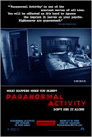 Paranormal Activity uses an actual screenshot from the film as its main image on the poster. The text used is very significant because the screenshot used only gives the consumer so much, whereas when the text is added in Red and not a natural font it makes the poster stand out and gives the consumer an idea of what the film is about.
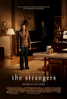 The strangers film poster uses natural colours of house lighting but they blacken out the surroundings so that the person in the middle of the poster looks more vunerable then she noramlly would. For an added affect they have one of the taunters in the background watching her every move so that the consumer gets the feel of the hairs standing up on the back of there neck. The text also states that it is "inspired by true events." Because of this use of text the consumer automatcially knows that this has happened to someone in reality making the consumer feel vunerable too.
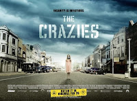 The film poster of "The Crazies" uses a clouded sky which gives a the consumer the idea that some kind of storm is coming but they dont know if its the weather or if its a metaphoric storm such as a war or something. The colours used a natural colours so this makes you think that everything is fine. The last aspect of this film poster is that there is a young girl standing in a desrted town with a gas mask on. Because this is used the consumer gets a senstaion that everything is not as it seems.
A romance film's poster usually use very soft colours that are not bright and harsh to the eyes. The colours associated with romance films posters show the consumer that the film doesnt contain any gore or violence but is more of a "chick flick" than a thriller or an action movie.
Here is some examples of romantic film posters.
 Letters to Juliet uses very calm and neutral colours which tell the reader that the film has a very non complex storyline and it can be easily consumed.
 The love & Other Drugs film poster is a little different to the normal conventions of a romance film poster. It uses dark red for a main background instead of a soft colour such as a peach or cream. The poster still shows the reader it is a romantic film but in a different way to other romance films. It does this by having the actors lying on a bed naked being covered by pillows. This instanly tells the consumer that there will be no action or gore involved.
A Horror Genre film poster is alot different to that of a romance film poster. It uses more dark colours such as blacks, Dark blues and blood reds. This can instanly tell the consumer that the film will be action packed and will contain gore just by the colours and the layouts it uses. Below are some examples of horror film posters.
 Paranormal Activity uses an actual screenshot from the film as its main image on the poster. The text used is very significant because the screenshot used only gives the consumer so much, whereas when the text is added in Red and not a natural font it makes the poster stand out and gives the consumer an idea of what the film is about.
 The strangers film poster uses natural colours of house lighting but they blacken out the surroundings so that the person in the middle of the poster looks more vunerable then she noramlly would. For an added affect they have one of the taunters in the background watching her every move so that the consumer gets the feel of the hairs standing up on the back of there neck. The text also states that it is "inspired by true events." Because of this use of text the consumer automatcially knows that this has happened to someone in reality making the consumer feel vunerable too.
A thriller's film poster sometimes has a horror's charateristics but they are made so that the consumer can look at a poster and can tell if its a thriller or horror genre of film.
Below are some examples of thrillers film posters.
 The film poster of "The Crazies" uses a clouded sky which gives a the consumer the idea that some kind of storm is coming but they dont know if its the weather or if its a metaphoric storm such as a war or something. The colours used a natural colours so this makes you think that everything is fine. The last aspect of this film poster is that there is a young girl standing in a desrted town with a gas mask on. Because this is used the consumer gets a senstaion that everything is not as it seems.
 Shutter Island is a thriller which is based on a detective trying to find a missing patient at a mental hospital which is based on an island. Throughtout the film we follow Leonardo Dicaprio who uncovers the truth about the missing patient which is infact him. The reason why he is a detective is because he plays a detective and the people who are in charge of the hospital allow him to play through his story to try and cure him. The poster uses a picture of the island during a storm with the sea very rough abnd heavy rainfull. The reason they use this is because a storm usually means thats something bad is going to happen or that all is not as it seems. By using the image at the top of the poster you get a sense that this film is a mystery because of the use of the match.
What is a magazine review?
The magazine review is one of the secondary products that we have decided to produce along with our main production of a thriller and the other secondary production which is the poster. I have been doing some research into magazine articles and the layouts that they choose. The magazine article must be on a double page spread and consist of a some screen shots from the film and then an article on the film.
Below are some links to magazine layout Ideas:
We have looked at some templates for a magazine double page spread and have considered what would look the best for a thriller film. They all basically consist of a large screenshot from the film which covers most of the double page spread. Smaller screen shots are also used so that the reader can have more than one perspective on the film that he is about to read about. Underneath each of the film screenshots there is usually a caption about 1 or 2 lines long explaining what is happeneing in the picture. At either the sides or the bottem of the double page spread there is a write up which gives a review on the film and quotes from people that have viewed the film. It will also have a star rating and the using of exciting words such as, Exhilarating, Amazing, Breath taking etc. With the use of these words the reader creates a picture for themself from just reading a few words.
Thursday, January 13, 2011
Change of plan
We have decided not to use the idea of live footage as we believe that it would be to hard to create. The problems that we encountered were that we couldnt think of a way to edit scenes. What I mean is that with the use of live footage everything has to be one continious piece of filming with no cuts in it. We had come up with the idea of having previous events already filmed on the camera like for example a wedding which we could then cut to to have a break in the film so editing could take place. Because we believe that we are not capable of creating a live footage film we have decided to still create a thriller film but not using live footage.
Subscribe to:
Comments (Atom)
