Key
Red-Not started
Yellow- Started but not yet finished
Green-Completed.
Print:
Level 3 36-47 Marks
There is evidence of proficiency in the creative use of many of the following technical skills:
framing a shot, including and excluding elements as appropriate;
using a variety of shot distances as appropriate;
shooting material appropriate to the task set;
selecting mise-en-scène including colour, figure, lighting, objects and setting;
manipulating photographs as appropriate to the context for presentation, including cropping and resizing;
accurately using language and register;
appropriately integrating illustration and text;
showing understanding of conventions of layout and page design;
showing awareness of the need for variety in fonts and text size;
using ICT appropriately for the task set.
Level 4 48–60 marks
There is evidence of excellence in the creative use of most of the following technical skills:
framing a shot, including and excluding elements as appropriate;
using a variety of shot distances as appropriate;
shooting material appropriate to the task set;
selecting mise-en-scène including colour, figure, lighting, objects and setting;
manipulating photographs as appropriate to the context for presentation, including cropping and resizing;
accurately using language and register;
appropriately integrating illustration and text;
showing understanding of conventions of layout and page design;
showing awareness of the need for variety in fonts and text size;
Using ICT appropriately for the task set.
Video:
Level 3 36–47 marks
There is evidence of proficiency in the creative use of many of the following technical skills:
holding a shot steady, where appropriate;
framing a shot, including and excluding elements as appropriate;
using a variety of shot distances as appropriate;
shooting material appropriate to the task set;
selecting mise-en-scène including colour, figure, lighting, objects and setting;
editing so that meaning is apparent to the viewer;
using varied shot transitions and other effects selectively and appropriately for the task set;
using sound with images and editing appropriately for the task set;
using titles appropriately.
Level 4 48–60 marks
There is evidence of excellence in the creative use of most of the following technical skills:
holding a shot steady, where appropriate;
framing a shot, including and excluding elements as appropriate;
using a variety of shot distances as appropriate;
shooting material appropriate to the task set;
selecting mise-en-scène including colour, figure, lighting, objects and setting;
editing so that meaning is apparent to the viewer;
using varied shot transitions and other effects selectively and appropriately for the task set;
using sound with images and editing appropriately for the task set;
using titles appropriately.
Audio
Level 3 36–47 marks
There is evidence of proficiency in the creative use of many of the following technical skills:
recording voice(s) clearly in studio/confined setting;
recording voice(s) clearly in location/outdoor interviews/presentations;
accurately using language and register;
integrating recorded material, as appropriate;
editing and mixing sounds appropriately;
editing to create continuity and meaning;
integrating jingles, music, location sounds and sound effects, where appropriate.
framing a shot, including and excluding elements as appropriate;
using a variety of shot distances as appropriate;
shooting material appropriate to the task set;
selecting mise-en-scène including colour, figure, lighting, objects and setting;
manipulating photographs as appropriate to the context for presentation, including cropping and resizing;
accurately using language and register;
appropriately integrating illustration and text;
showing understanding of conventions of layout and page design;
showing awareness of the need for variety in fonts and text size;
Using ICT appropriately for the task set.
Video:
Level 3 36–47 marks
There is evidence of proficiency in the creative use of many of the following technical skills:
holding a shot steady, where appropriate;
framing a shot, including and excluding elements as appropriate;
using a variety of shot distances as appropriate;
shooting material appropriate to the task set;
selecting mise-en-scène including colour, figure, lighting, objects and setting;
editing so that meaning is apparent to the viewer;
using varied shot transitions and other effects selectively and appropriately for the task set;
using sound with images and editing appropriately for the task set;
using titles appropriately.
Level 4 48–60 marks
There is evidence of excellence in the creative use of most of the following technical skills:
holding a shot steady, where appropriate;
framing a shot, including and excluding elements as appropriate;
using a variety of shot distances as appropriate;
shooting material appropriate to the task set;
selecting mise-en-scène including colour, figure, lighting, objects and setting;
editing so that meaning is apparent to the viewer;
using varied shot transitions and other effects selectively and appropriately for the task set;
using sound with images and editing appropriately for the task set;
using titles appropriately.
Audio
Level 3 36–47 marks
There is evidence of proficiency in the creative use of many of the following technical skills:
recording voice(s) clearly in studio/confined setting;
recording voice(s) clearly in location/outdoor interviews/presentations;
accurately using language and register;
integrating recorded material, as appropriate;
editing and mixing sounds appropriately;
editing to create continuity and meaning;
integrating jingles, music, location sounds and sound effects, where appropriate.
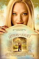 Letters to Juliet uses very calm and neutral colours which tell the reader that the film has a very non complex storyline and it can be easily consumed.

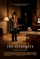 The strangers film poster uses natural colours of house lighting but they blacken out the surroundings so that the person in the middle of the poster looks more vunerable then she noramlly would. For an added affect they have one of the taunters in the background watching her every move so that the consumer gets the feel of the hairs standing up on the back of there neck. The text also states that it is "inspired by true events." Because of this use of text the consumer automatcially knows that this has happened to someone in reality making the consumer feel vunerable too.
