A romance film's poster usually use very soft colours that are not bright and harsh to the eyes. The colours associated with romance films posters show the consumer that the film doesnt contain any gore or violence but is more of a "chick flick" than a thriller or an action movie.
Here is some examples of romantic film posters.
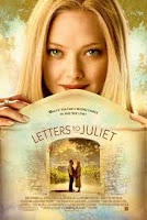 Letters to Juliet uses very calm and neutral colours which tell the reader that the film has a very non complex storyline and it can be easily consumed.
 The love & Other Drugs film poster is a little different to the normal conventions of a romance film poster. It uses dark red for a main background instead of a soft colour such as a peach or cream. The poster still shows the reader it is a romantic film but in a different way to other romance films. It does this by having the actors lying on a bed naked being covered by pillows. This instanly tells the consumer that there will be no action or gore involved.
A Horror Genre film poster is alot different to that of a romance film poster. It uses more dark colours such as blacks, Dark blues and blood reds. This can instanly tell the consumer that the film will be action packed and will contain gore just by the colours and the layouts it uses. Below are some examples of horror film posters.
 Paranormal Activity uses an actual screenshot from the film as its main image on the poster. The text used is very significant because the screenshot used only gives the consumer so much, whereas when the text is added in Red and not a natural font it makes the poster stand out and gives the consumer an idea of what the film is about.
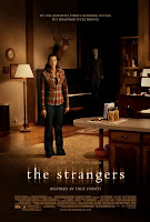 The strangers film poster uses natural colours of house lighting but they blacken out the surroundings so that the person in the middle of the poster looks more vunerable then she noramlly would. For an added affect they have one of the taunters in the background watching her every move so that the consumer gets the feel of the hairs standing up on the back of there neck. The text also states that it is "inspired by true events." Because of this use of text the consumer automatcially knows that this has happened to someone in reality making the consumer feel vunerable too.
A thriller's film poster sometimes has a horror's charateristics but they are made so that the consumer can look at a poster and can tell if its a thriller or horror genre of film.
Below are some examples of thrillers film posters.
 The film poster of "The Crazies" uses a clouded sky which gives a the consumer the idea that some kind of storm is coming but they dont know if its the weather or if its a metaphoric storm such as a war or something. The colours used a natural colours so this makes you think that everything is fine. The last aspect of this film poster is that there is a young girl standing in a desrted town with a gas mask on. Because this is used the consumer gets a senstaion that everything is not as it seems.
Shutter Island is a thriller which is based on a detective trying to find a missing patient at a mental hospital which is based on an island. Throughtout the film we follow Leonardo Dicaprio who uncovers the truth about the missing patient which is infact him. The reason why he is a detective is because he plays a detective and the people who are in charge of the hospital allow him to play through his story to try and cure him. The poster uses a picture of the island during a storm with the sea very rough abnd heavy rainfull. The reason they use this is because a storm usually means thats something bad is going to happen or that all is not as it seems. By using the image at the top of the poster you get a sense that this film is a mystery because of the use of the match.
No comments:
Post a Comment