A2 Media Ben Goulder
Friday, March 25, 2011
Thursday, March 24, 2011
Finished production
Untitled from JamieReeves on Vimeo.
Here is the finished film all edited and completed. We are happy with it even with the problems we faced throughout the production of it.
Thursday, March 17, 2011
Ancilery Products
The magazine review has now been completed by myself, Jamie reeves and conor murray. Conor completed the layout and some of the information that is in the magazine review and I also contributed to the information in the review about our film. The magazine review is 2 A4 pages which is set in into a double page spread. The review consists of information about the film and some of the techniques that are used in it and also some ratings of the film from other sources and some screen shots of the film.
Below is a link to our magazine review.
Magazine review
Film Poster
The film poster has now been completed by Jamie reeves, Conor murray and myself. Jamie completed the layout of the pictures text and headings that are included on our poster. Conor Murray was the person that provided the photos that are included on our poster. I completed a draft layout of how our poster was going to look who I then gave to jamie to completed our final poster because he is more experienced with using photoshop.
Below is a link to our film poster
Film Poster
Thursday, March 3, 2011
Exhibition.
Thursday, February 17, 2011
Character models.
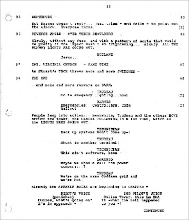
Our script
- 12pt Dark Courier
- Left margin: 1.6in (4.06cm)
- Right margin: 3/4in (1.9cm)
- Dialogue: 2.6in(6.5cm)
- Character Name: 3.9in (10.0cm)
- Parentheticals: 3.3in (8.0cm)
- Character Names: Upper case on first introduction, lower case from then on
- CAPITALISE: Significant props and sound (eg. a KNIFE, a BANG)
- CAPITALISE: Key points of direction (eg. ZOOM, JUMP-CUT)
Thursday, February 10, 2011
What our audience would be according to the regulation bodies
Using the NRS social grade which determines a household into each category by using the occupation of the head of the household to organise them. By looking at each of the grades we are aiming for the C2-D grade. This is because we are aiming at a younger audience and we assume that younger people would be in these categories because young people tend not to have a highly paid profession when they are younger. We have Identified a young audience because they are the biggest film consumers out of all the age groups.
The acorn system categrises all of the united kingdom postcodes into various types based on census data and other information such as lifestyle surveys. By using this data we asume that a younger audience would be classified in moderate means and possibly hard pressed groups. We are aiming at these because we believe that a younger audience would mainly be asociated with these groups.
Thursday, February 3, 2011
Conventions of a short film.
- Short films all generally follow the same style of how they are filmed. I have watched a few short films now and I have noticed that they usually contain no more than three characters with one of them being mainly focused on.
- Also the storyline that they have tend to have a twist in them. This is because they are so short that if they didn't include a twist in them they just simply wouldn't be enticing to an audience. Short films also tend to have a lot of point of view shots. This is because short films are mainly about a characters life and the best way to portray this story is to see it how the character sees it.
- Voice overs are a very popular method of sound in short films, and it is often found in short films that a voice over would be used instead of dialogue, there could be many reasons for this, for one it is cheaper to record a voice over than use a high tech boom, but also if the story is about someone's life, the voice over would normally be that of the central protagonist.
- Another convention that a short film has is that it tends to be between 1-5 minutes long.
First time using photoshop.
Market Research Review
Review of Market Research from JamieReeves on Vimeo.
Market Research
Market Feedback from JamieReeves on Vimeo.
A link to the full post. Jamie reeves
Monday, January 31, 2011
Progress Specification
Key
Red-Not started
Yellow- Started but not yet finished
Green-Completed.
Print:
Level 3 36-47 Marks
There is evidence of proficiency in the creative use of many of the following technical skills:
framing a shot, including and excluding elements as appropriate;
using a variety of shot distances as appropriate;
shooting material appropriate to the task set;
selecting mise-en-scène including colour, figure, lighting, objects and setting;
manipulating photographs as appropriate to the context for presentation, including cropping and resizing;
accurately using language and register;
appropriately integrating illustration and text;
showing understanding of conventions of layout and page design;
showing awareness of the need for variety in fonts and text size;
using ICT appropriately for the task set.
Level 4 48–60 marks
framing a shot, including and excluding elements as appropriate;
using a variety of shot distances as appropriate;
shooting material appropriate to the task set;
selecting mise-en-scène including colour, figure, lighting, objects and setting;
manipulating photographs as appropriate to the context for presentation, including cropping and resizing;
accurately using language and register;
appropriately integrating illustration and text;
showing understanding of conventions of layout and page design;
showing awareness of the need for variety in fonts and text size;
Using ICT appropriately for the task set.
Video:
Level 3 36–47 marks
There is evidence of proficiency in the creative use of many of the following technical skills:
holding a shot steady, where appropriate;
framing a shot, including and excluding elements as appropriate;
using a variety of shot distances as appropriate;
shooting material appropriate to the task set;
selecting mise-en-scène including colour, figure, lighting, objects and setting;
editing so that meaning is apparent to the viewer;
using varied shot transitions and other effects selectively and appropriately for the task set;
using sound with images and editing appropriately for the task set;
using titles appropriately.
Level 4 48–60 marks
There is evidence of excellence in the creative use of most of the following technical skills:
holding a shot steady, where appropriate;
framing a shot, including and excluding elements as appropriate;
using a variety of shot distances as appropriate;
shooting material appropriate to the task set;
selecting mise-en-scène including colour, figure, lighting, objects and setting;
editing so that meaning is apparent to the viewer;
using varied shot transitions and other effects selectively and appropriately for the task set;
using sound with images and editing appropriately for the task set;
using titles appropriately.
Audio
Level 3 36–47 marks
There is evidence of proficiency in the creative use of many of the following technical skills:
recording voice(s) clearly in studio/confined setting;
recording voice(s) clearly in location/outdoor interviews/presentations;
accurately using language and register;
integrating recorded material, as appropriate;
editing and mixing sounds appropriately;
editing to create continuity and meaning;
integrating jingles, music, location sounds and sound effects, where appropriate.
Thursday, January 27, 2011
Poster Analysis
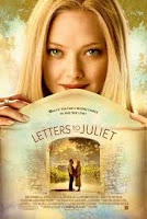 Letters to Juliet uses very calm and neutral colours which tell the reader that the film has a very non complex storyline and it can be easily consumed.
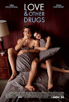 The love & Other Drugs film poster is a little different to the normal conventions of a romance film poster. It uses dark red for a main background instead of a soft colour such as a peach or cream. The poster still shows the reader it is a romantic film but in a different way to other romance films. It does this by having the actors lying on a bed naked being covered by pillows. This instanly tells the consumer that there will be no action or gore involved.
A Horror Genre film poster is alot different to that of a romance film poster. It uses more dark colours such as blacks, Dark blues and blood reds. This can instanly tell the consumer that the film will be action packed and will contain gore just by the colours and the layouts it uses. Below are some examples of horror film posters.
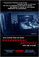 Paranormal Activity uses an actual screenshot from the film as its main image on the poster. The text used is very significant because the screenshot used only gives the consumer so much, whereas when the text is added in Red and not a natural font it makes the poster stand out and gives the consumer an idea of what the film is about.
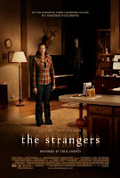 The strangers film poster uses natural colours of house lighting but they blacken out the surroundings so that the person in the middle of the poster looks more vunerable then she noramlly would. For an added affect they have one of the taunters in the background watching her every move so that the consumer gets the feel of the hairs standing up on the back of there neck. The text also states that it is "inspired by true events." Because of this use of text the consumer automatcially knows that this has happened to someone in reality making the consumer feel vunerable too.
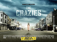 The film poster of "The Crazies" uses a clouded sky which gives a the consumer the idea that some kind of storm is coming but they dont know if its the weather or if its a metaphoric storm such as a war or something. The colours used a natural colours so this makes you think that everything is fine. The last aspect of this film poster is that there is a young girl standing in a desrted town with a gas mask on. Because this is used the consumer gets a senstaion that everything is not as it seems.
 What is a magazine review?
Thursday, January 13, 2011
Change of plan
Thursday, December 30, 2010
What we rate our film as
We have decided that our film would have a 12 certificate. This is because we are using some violence and we are also debating whether to have any blood and gore visible. Another reason why we think we should give our film a 12 age rating is that we are not planning on using any drugs in our short film. We have also decided that we wont be using any nudity in our production or any sexual activity. After we decided all of this we looked at the BBFC and compared our results to that of the BBFC. It became clear that the 12 certificate would be the correct age for our production.

Thursday, December 9, 2010
Audience classification and Regulatory bodies
The NRS Social Grade
Here is a link to How we are applying it to our audience.
The NRS social grades are a system of demographic classification used in the United Kingdom. They were originally developed by the National Readership Survey in order to classify readers, but are now used by many other organisations for wider applications and have become a standard for market research.
The classifications are based on the occupation of the head of the household.
Grade Social class Chief income earner's occupation
- A Upper middle class Higher managerial, administrative or professional.
- B Middle class Intermediate managerial, administrative or professional.
- C1 Lower middle class Supervisory or clerical and junior managerial, administrative or professional.
- C2 Skilled working class Skilled manual workers.
- D Working class Semi and unskilled manual workers.
- E Those at the lowest levels of subsistence Casual or lowest grade workers, pensioners and others who depend on the welfare state for their income.
ACORN (Acronym for A Classification of Residential Neighborhoods) is a geodemographic information system categorizing all United Kingdom postcodes into various types based upon census data and other information such as lifestyle surveys.
Here are the catorgies that the ACORN system use in desending order.
- Wealthy Achievers
- Urban Prosperity
- Comfortably Off
- Moderate Means
- Hard Pressed
Everyone in the united kingdom is under one of this Catorgies. This is then used by the media to target specific people that they which to use for there product.
BBFC (British Board of Film Classification)
The BBFC is a non governmental orgainisation funded by the film industry and is responsible for the classification of films in the united kingdom. It was founded in 1912 and gives people a perspective on what the film is like and what it includes. A classification is basically a guideline for parents so they can see what the film or game entails. Cinema's use these certificates so that children who are under the age of the certificate wont be viewing things that they should not see.
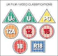
For a film to have the correct certificate applied to it they have to pass through a few processes. The film is first view by a group of examiners who analyse sections of the film and then give them the age rating that suits that section best. The producers of the film then have a chance to change certain parts of the film to achieve the ceftificate that they wont. If they do not decide to change certain sections of the film then consequently the age certificate will be higher.
A film with a 12 certificate is classed as a 12 if it contains infrequent drugs, infrequent use of strong language, brief nudity, discreet sexual activity, and moderate violence. An example could be The Dark Knight this is because it contains some violence.
A film with an 18 certificate is classified as an 18 if it contains very strong violence, A major extent of drug abuse, Very strong language and sex scenes. An example of a film with an 18 certificate would be any of the Saw films. This is because they contain very strong violence and a strong use of blood and gore.
The Effects Model
The hypodermic needle model
The intended message is directly received and wholly accepted by the receiver. Just think of it as a big needle full of the product and it directly injected into your head.
 Two-step flow
The people with most access to media, and highest media literacy explain and diffuse the content to others. This is a modern version of the hypodermic needle model. Uses and gratifications
People are not helpless victims of mass media, but use the media to get specific gratifications. Some people are worried that the media is gaining to much power over people.
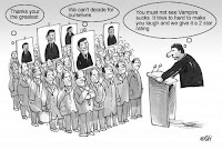 Reception theory
The meaning of a "text" is not inherent within the text itself, but the audience must elicit meaning based on their individual cultural background and life experiences.
 Obstinate audience theory
This theory assumes that there is a transactional communication between the audience and the media. The audience actively selects what messages to pay attention to. The Zimmerman-Bauer study found that the audience also participates in the communication by influencing the message.
Thursday, November 25, 2010
What is a short film?
North America classes a short film being between 20-40 minutes long, but in europe the definition is used if the film is longer than 1 minute but shorter than 15 minutes.
http://en.wikipedia.org/wiki/Short_film
The North American definition also tends to focus much more on character whereas the European forms tend to depend much more on visual drama and plot twists. In this way, the North American form can be understood to be a derivation of the feature film form, usually acting as a platform for aspirant Hollywood directors. Elsewhere, short films tend to work as showcases for cinematographers and commercial directors. When the majority of feature films began to be made in much longer-running editions. A typical film program came to be expected to include a feature preceded by one or more short subjects. Short subjects could be live action or animated.
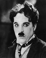
Comedy was particularly utilized, and well-known comedians such as Laurel and Hardy, Charlie Chaplin, Buster Keaton and others are known for their short films as well as their features.

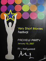
The International Festival of Very Shorts is a festival based in Paris which shows only films less than three minutes long.
Filminute, the international one-minute film festival, has presented and promoted a collection of one-minute films across multiple media since September 2006.
Pitch Finally uploaded.
Pitch by Ben, Conor, Jamie from Ben Goulder on Vimeo.
Here is our first pitch that shows what we plan to do for this part of the task. We are planning to create a film using found footage and the subsidiary tasks we are doing is the poster and the magazine review.
Thursday, November 18, 2010
Pitch filmed
Today's plan.
Monday, November 1, 2010
Our pitch
Thursday, October 21, 2010
Animatic
Foo fighters the pretender Animatic from Ben Goulder on Vimeo.
Initial Ideas
We are yet to decide on the all of the events but our storyboard will show the complete story.
Thursday, September 30, 2010
The target I set myself
There is evidence of proficiency in the creative use of many of the following technical skills:
holding a shot steady, where appropriate;
framing a shot, including and excluding elements as appropriate;
using a variety of shot distances as appropriate;
shooting material appropriate to the task set;
selecting mise-en-scène including colour, figure, lighting, objects and setting;
editing so that meaning is apparent to the viewer;
using varied shot transitions and other effects selectively and appropriately for the task set;
using sound with images and editing appropriately for the task set;
• using titles appropriately.
Im aiming for a level three for my practical work. I think this because the targets are as high as I believe my capibilities will allow me to get.
Targets
- There is evidence of a basic level of ability in the creative use of some of the following technical skills:
- Holding a shot steady, where appropriate;
- Framing a shot, including and excluding elements as appropriate;
- Using a variety of shot distances as appropriate;
- Shooting material appropriate to the task set;
- Selecting mise-en-scène including colour, figure, lighting, objects and setting;
- Editing so that meaning is apparent to the viewer;
- Using varied shot transitions and other effects selectively and appropriately for the task set;
- Using sound with images and editing appropriately for the task set;
- Using titles appropriately.
60
Level 3 36–47 marks
There is evidence of proficiency in the creative use of many of the following technical skills:
- Holding a shot steady, where appropriate;
- Framing a shot, including and excluding elements as appropriate;
- Using a variety of shot distances as appropriate;
- Shooting material appropriate to the task set;
- Selecting mise-en-scène including colour, figure, lighting, objects and setting;
- Editing so that meaning is apparent to the viewer;
- Using varied shot transitions and other effects selectively and appropriately for the task set;
- Using sound with images and editing appropriately for the task set;
- Using titles appropriately.
I am going to aim to tick most of these points in my Task to achieve what I feel I can.
Our task
a poster for the film;
a radio trailer for the film;
a film magazine review page featuring the film.
The reason we have chosen this task is because we feel that film is our strongest field of work, and making a live action film is something that we have all wanted to do. The two subsidiary tasks that we have decided to do is the poster for out film and a film magazine review page featuring the film. We did not chose to do the radio trailer for the film because we didn't feel confident enough to take on this task as we didn't have any experience of how to create a radio broadcast.
Tuesday, July 6, 2010
Thursday, July 1, 2010
My favorite music video of all time
The reason why this is my favorite music video has three main points that I like. The first is that I enjoy listening to the song and it is one of my favorite songs. The second and third reasons are that it is very unique and it surprised me because it has no storyline and the events that happen are very random EG: There are 41+ riot patrol officers that line up and attempt to take out a band of 4 members. Another example is the Solid red wall behind the band the first time I viewed this music video I did not expect it to explode like that.
